How to Choose the Perfect Color Palette (and Design) For Your Home

“The best color in the whole world is the one that looks good on you,” the late French designer Gabriele “Coco” Chanel once said. While she may have been right about color in fashion, the jury’s still out about color for custom homes.
What exactly is the best way to approach interior and color design for your home?
You might be wondering: how do I choose the right color scheme? Yes, the color looks great on paint chips, but what about when the color is on my new home’s four walls? How can I make sure the color and design match what I see in front of me?
Finding the perfect color scheme: we understand the struggle. Don’t fret: we can help.
Color and Interior Design Made Easy
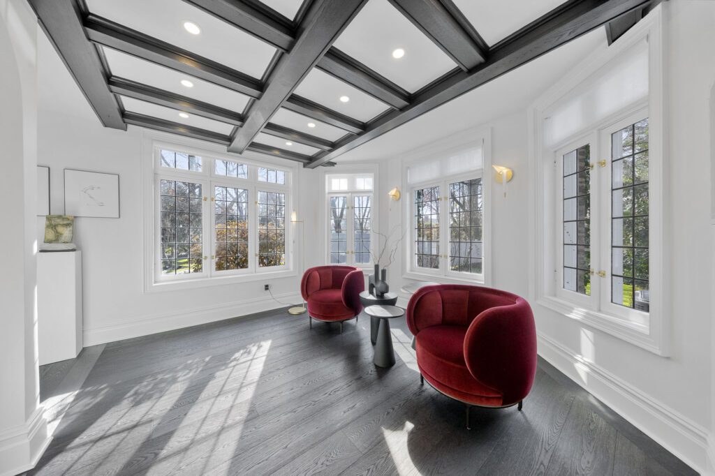

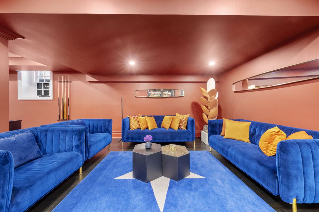

At WA Construct, we’ve been designing and building award-winning home remodel contractor with beautiful luxury designs for the last twenty-plus years. And we’ve learned so much from customers like you along the way.
We invite you to join us as we break down the process of crafting a winning color and interior design scheme for your new custom home. Sit back, relax, and grab a glass of your favorite sparkling beverage.
In this post, we’ll teach you how to choose, apply, and complete where each color goes, so you can create the spectacular finish you’ve always dreamed of — on a home you’ll cherish for years to come.
Rest easy, take a sip, and enjoy. Let’s learn how to choose, apply, and craft an award-winning color scheme and design for your new custom home.
How to Choose a Winning Interior Color Scheme
Coco Chanel was right about one thing. You have to like the look and feel good about your color choice.
The following seven color scheme rules of thumb can help channel your inner Chanel when it comes to designing a beautiful color arrangement in your new custom home.
Start with your home's fixed elements
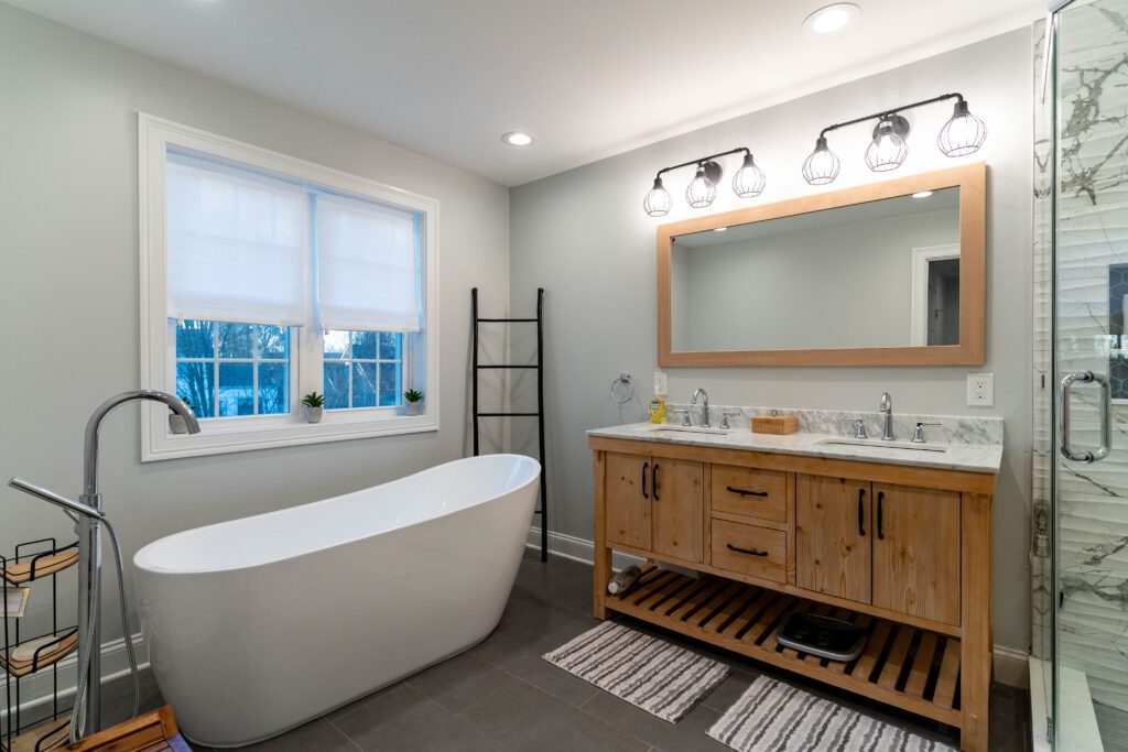
Consider light fixtures, cabinets, flooring, wall tiles, countertops, and the existing design of your general space before picking out your home’s colors. Considering fixed elements will help you find stunning colors that match your intended aesthetic.
While creating different layouts and ambiances requires using different materials, we recommend starting your exploration of colors with the fixed elements and structures of your home.
Caution: do not skip this step before choosing your color scheme. Many homeowners will pick a color before taking into account furniture, light fixtures, ovens, and more.
They often later regret picking the colors before factoring in these fixed elements. Why? Because the color’s tint, hue, and saturation looks different than how they expected on paper.
They didn’t factor in the effects that the lighting and furniture colors had on the paint job rendered on their four walls.
So, do make sure to pre-plan and note how the spaces look in your home. Once you’ve noted the existing structure and spaces in your home, it’s time to tackle each room’s color schemes.

Focus on one room at a time
This is where the magic happens. Once you know which items in your home will stay fixed and which can be moved, you can begin brainstorming color and design ideas for each room.
We suggest starting with the living room. Research suggests homeowners and residents spend the bulk of their days (nearly 20%!) in their living rooms.
For the amount of time we spend in our living rooms, wouldn’t you want a color scheme that makes you feel at home?
If you choose not to take this time to pick complementing colors, the alternative is you’ll spend 20% (or more) of your days in a room that feels icky, stale, or — god forbid — foreign. Consider focusing on the function, purpose, and amount of time spent in each room to make the most of your color scheme.

From darkness to light
Have you ever been in a room that felt cluttered and cramped, yet there was plenty of breathable space? Did you wonder why the room felt that way?
The reason it felt foreign and tight was likely because the homeowners likely designed their home without this crucial principle: the principle of designing with a natural gradient of dark to light colors.
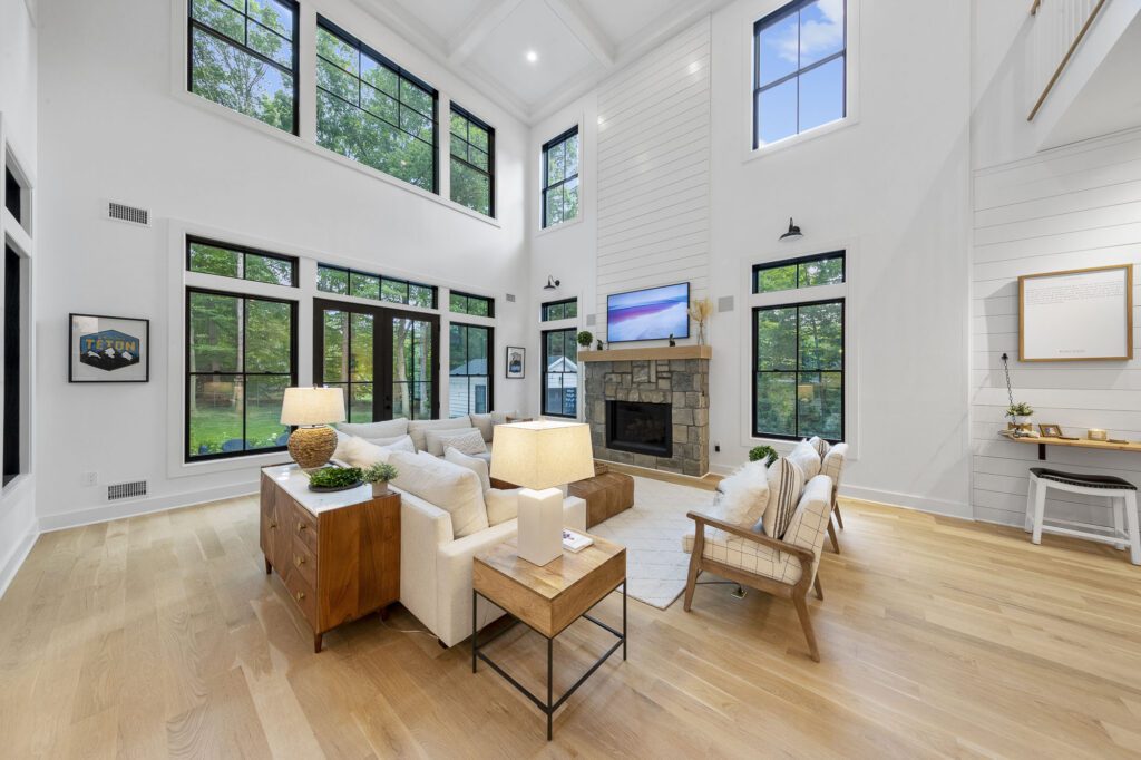
Following a natural gradient from dark to light — from bottom to top of the home — is a smart design choice, because this gradient mimics natural outdoor lighting (Just as the earth is darker than the sky).
Designing your home from dark to light can make a world of difference in how spacious and warm your home is — as well as how natural light interacts and plays with the shadows created from natural light.
Consider starting with a single shade of color and moving along a natural gradient with the darkest color being used for the floor, mid-tones for the walls and furniture accents, and lighter colors for the ceiling.
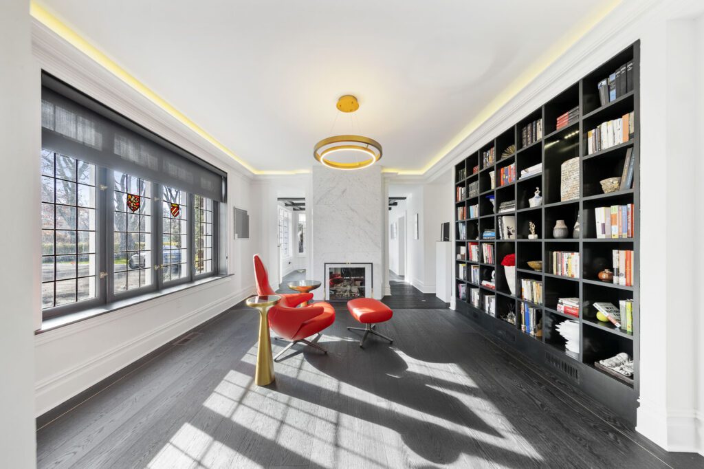

Your room's function and decor
Whether you’re curious to build out a peaceful nursery retrofitted with a snug crib, an organized workspace with a clean mahogany desk, or a cozy nook with plush pillows and a throw rug for reading, your color scheme will depend on how you use — and what objects you place in — your living spaces.
Consider the primary purpose of each living space and any divisions you prefer to keep when designing each room. Keeping in mind how you use — and what’s inside — your space will help you decide on the colors for your color palette.


Let the light in
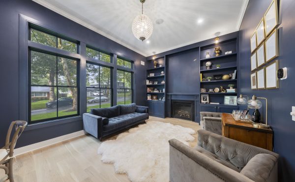
Light: it changes everything. Natural window light, LED lighting, chandeliers, and even lightbulb choice can shape the saturation and value of the colors of your room.
Before selecting your color scheme, experiment a little: how does the reading lamp affect the color and shadows on the wall? Are the colors in the fabrics muted when I open the blinds to the window? How does the arrangement of furniture affect the colors of my living space?
Playing with the objects in your room will affect the way you view the daylight streaming into each room. Plus, experimenting will help you choose which colors work best for each room.
Since daylight expresses itself uniformly over the entire visible spectrum of colors, consider spending time in each room at different parts of the day to see how daylight plays with the value and tone of each room’s design.

Prepare with supplies in mind
Most people forget this all-important step. For example, you’ll have all your paint chips, color schemes, and design options prepared, but then realize you’re dissatisfied with how they look once your home is finished.
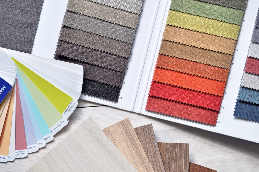
You can ensure your color and design schemes turn out exactly the way you envisioned by coming prepared with all your resources before building day(s). Consider how your design will look when you apply a layer of paint — called a skim coat — before painting your walls with your color schemes. Think about looking at trims that match your decor. Pick out lights and fixtures to complement the furniture.
You’ll want to prepare your color scheme with all the supplies and preparation materials you’ll need, so you’ll be prepared for any potential detour that could come up along the way on your design journey.
Not sure where to start with preparation and supplies? Don’t sweat it.
We created a convenient resource to help you prepare your new design with peace of mind. Our eBook outlines seven steps you can take to help you design your home with greater clarity and confidence.

Seek out inspiration
Floored by the tasks needed to create your color scheme? Your design-and-build team has access to a plethora of resources and knowledge to help you along your journey.
Whether you’re looking for design inspiration for a kitchen, living room, basement, or more, your home builder and architect team will be more than happy to guide you toward finding the perfect color scheme for all your home design needs.

How to Apply your Interior Color Scheme to your Home
You noted each room’s function, fixtures, light, and decor, and you’re delighted with the colors you’ve chosen. Well done! Now, it’s time to arrange and apply them in your home.
But what will it look like to put these colors to work? And how can you make sure you’re applying them right? We’ll break down the process of applying interior color schemes in homes, so you can start living and loving your new design.
Consult your design-and-build team
Before we start, though, know that you don’t have to go at it alone. Just like planning a wedding or buying a new vehicle, a team of experts will be there to help you through every step of the process.
The difference in working with a design-and-build team is that they’ll provide you with comprehensive resources for all your design needs.
But that’s not all. While some design-and-build teams provide a handful of eBooks and swatches of paint chips, that doesn’t cut it for us.
At WA Construct, we meet each client at a location that’s convenient for them to help them decide with confidence on a winning color scheme.
With our in-house architect team, we devote time and energy to learning about our clients’ design needs to help them evaluate their layout, architecture and design possibilities, and financial options. That way, our clients will know they’re receiving the color scheme they pictured in their heads.
Regardless of who you choose for your interior and color design needs, consult your design-and-build team to make sure your five-color color scheme — a topic that we’ll explore in the next section — turns out exactly the way you like it.


Choose your five-color color scheme
The next time you walk inside a friend, family member, or colleague’s house, do a quick study (discreetly, of course) of their home’s interior design. Take a mental snapshot of and note the six W’s:
- What colors do they use?
- Where do you tend to see the darkest and lightest colors?
- When do the colors change between — and within — rooms and spaces?
- Where do they use one color, complementary colors, and colors of the same family?
- Which colors are used more, and which colors are used less?
- Who is the room made for, and for what purpose?
Exploring these six questions with your architect and home-building team will help you navigate whether monochrome (one hue for your entire color palette), analogous (using adjacent colors on the color wheel), or complementary (opposite) color schemes will be best for your home’s five-color, award-winning color scheme.
Color #1: your neutrals
Neutrals: we’re not talking about a car’s transmission or having no opinion on a topic. Neutrals refer to the default color you use in the open and connected spaces of your home.
This color is your go-to color for those spaces in your home — spaces that you’re on the fence about when it comes to design.
Closet spaces, stairwells, and entranceways to the home: these places are wonderful spaces for using neutral colors.
Neutral colors help create seamless transitions between rooms — for example, a walkway that takes you from the kitchen to a home office.
Picking out a solid neutral will help you establish a baseline and give you peace of mind in those moments of uncertainty when deciding which color looks best in each part of your home.
Plus, these colors will help when picking out those bold colors that pop and shine — our next topic of discussion.



Color #2: bold colors
In addition to choosing at least one dark, one light, and one bright color for your home, consider choosing one color that pops and shines. This is your bold color — or the color that catches people’s attention.
Bold colors look great in dining and living rooms. You can even use these colors in entertainment or playrooms.
Most bold colors also work well as accents or complements to small rooms and spaces. If you’re looking to showcase the best parts of your home, consider choosing a bold color that spotlights the must-see features of your home’s living spaces.


Color #3: accent colors
While similar in function to bold colors, accent colors are used sparingly. These colors are used to evoke particular feelings, moods, or emotions in a room.
Accent colors can be used in different ways — depending on if opting for a monochromatic, analogous, or complementary color scheme.
Evoke a tranquil atmosphere in your bedroom by opting for a different shade or tint. Create a playful retreat for your little one by changing the tone and value of your nursery. Experiment with bright or lighter colors. The possibilities are endless!

Color #4: a second color to your bold
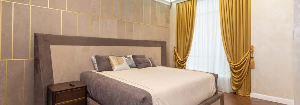
This “friend” color is similar to your bold color — though not quite as strong, making it more palatable on the eyes in spaces with muted aesthetics. Second colors are great for enclosed, small rooms that you’ll visit often — or to key places you’d prefer to highlight or showcase to guests.


Color #5: classic white
We saved this color for last because it’s adaptable and familiar. White is used for — well — just about everything else.
Since light colors tend to open up a space and make it feel more roomy, consider using white on the ceilings and around furniture. White complements cabinets and trim, as white helps create a clean finish for high-touch, hands-on areas you want to look pristine and functional.


Color #6: extended colors (optional)
Extended colors differ in shade (darkness) or tint (lightness). If you’re excited to try out a handful of colors throughout your home, using extended colors can help set the tone for each section of your home.
Just keep in mind the overall layout of the home: choosing extended colors in adjacent rooms can take time. Depending on how you arrange the colors, you’ll be creating very different moods throughout your home.
Consider how your chosen extended colors operate in relationship to each room and its lighting. Explore your options with your homebuilder today to see how you can set the mood of your living space with extended colors.
TL; DR: Summary
So, there you have it. Today, we learned about:
- Different terms related to interior design and architecture,
- Choosing award-winning color schemes and palettes for your home,
- Different types of colors you can apply in your home, and
- How to apply these color schemes to accent the tone and mood of each area of your home.
Build your Dream Sanctuary in the Lap of Luxury
Creating the design and color scheme of your home is one of the most exciting parts of the home-building process. But it can be daunting.
After all, you’ll be living with these colors day in and day out for as long as you reside in your new home. So, it’s important to choose wisely.
But we’d be lying if we said the time and energy it takes to craft the perfect design wasn’t worth it.
Live Inspired


Need some ideas for inspiration? Want to make sure you’re doing the design-and-build process right?
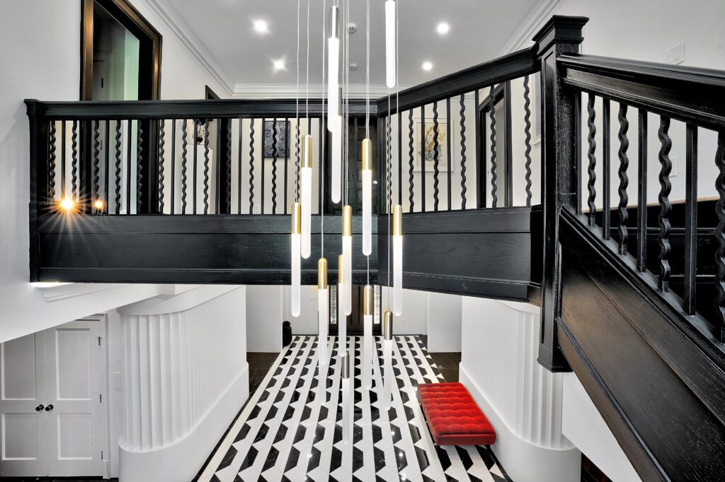
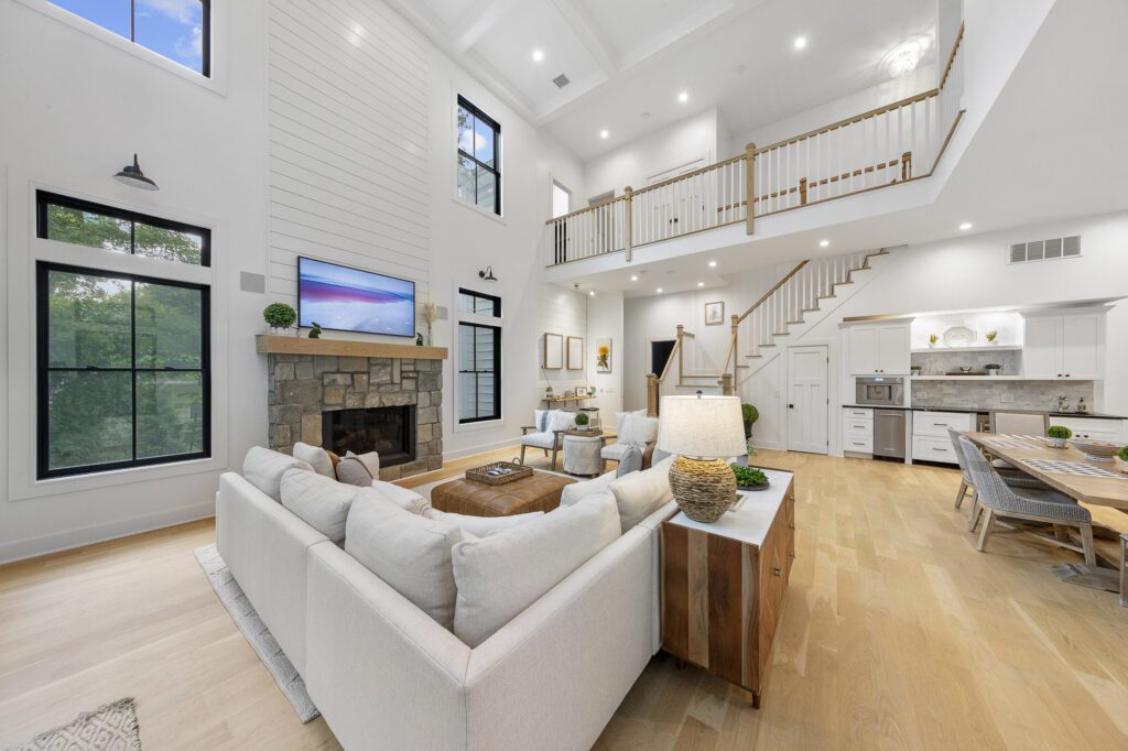
We hope this one last complimentary resource — a showcase of some of our most award-winning designs on the custom luxury home market — will inspire you to create the design and color scheme of your wildest imaginings. Please use it in good health.
If you need additional help along the way, though, know that we’re here for you. Don’t hesitate to contact us at any point, and we’d be happy to schedule a complimentary design consultation to discuss your interior design and color needs.
Until then, we wish you all the best in your design endeavors. Happy designing!


